


Learningbank
I rebuilt how learning is created and experienced in Learningbak's core tool.
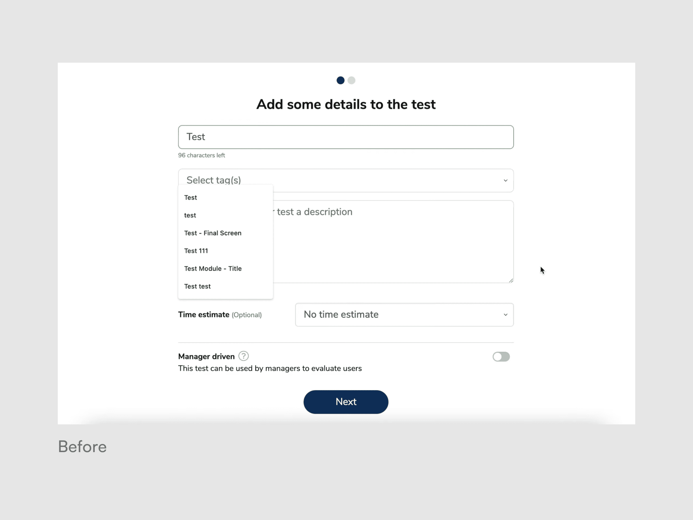
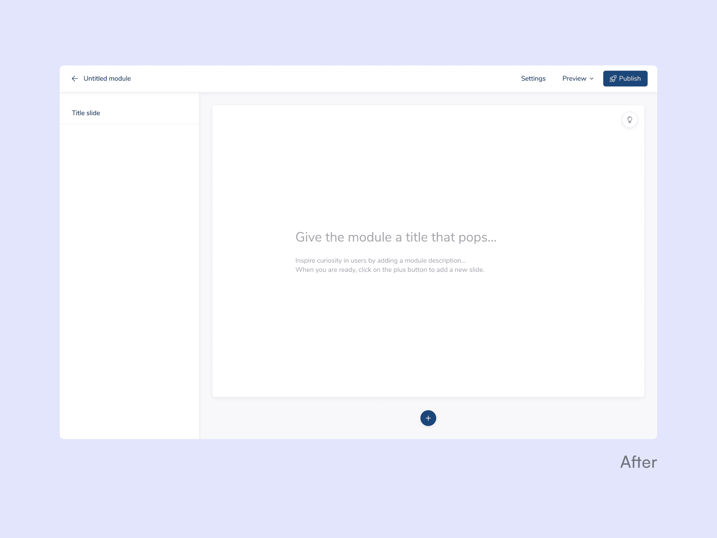
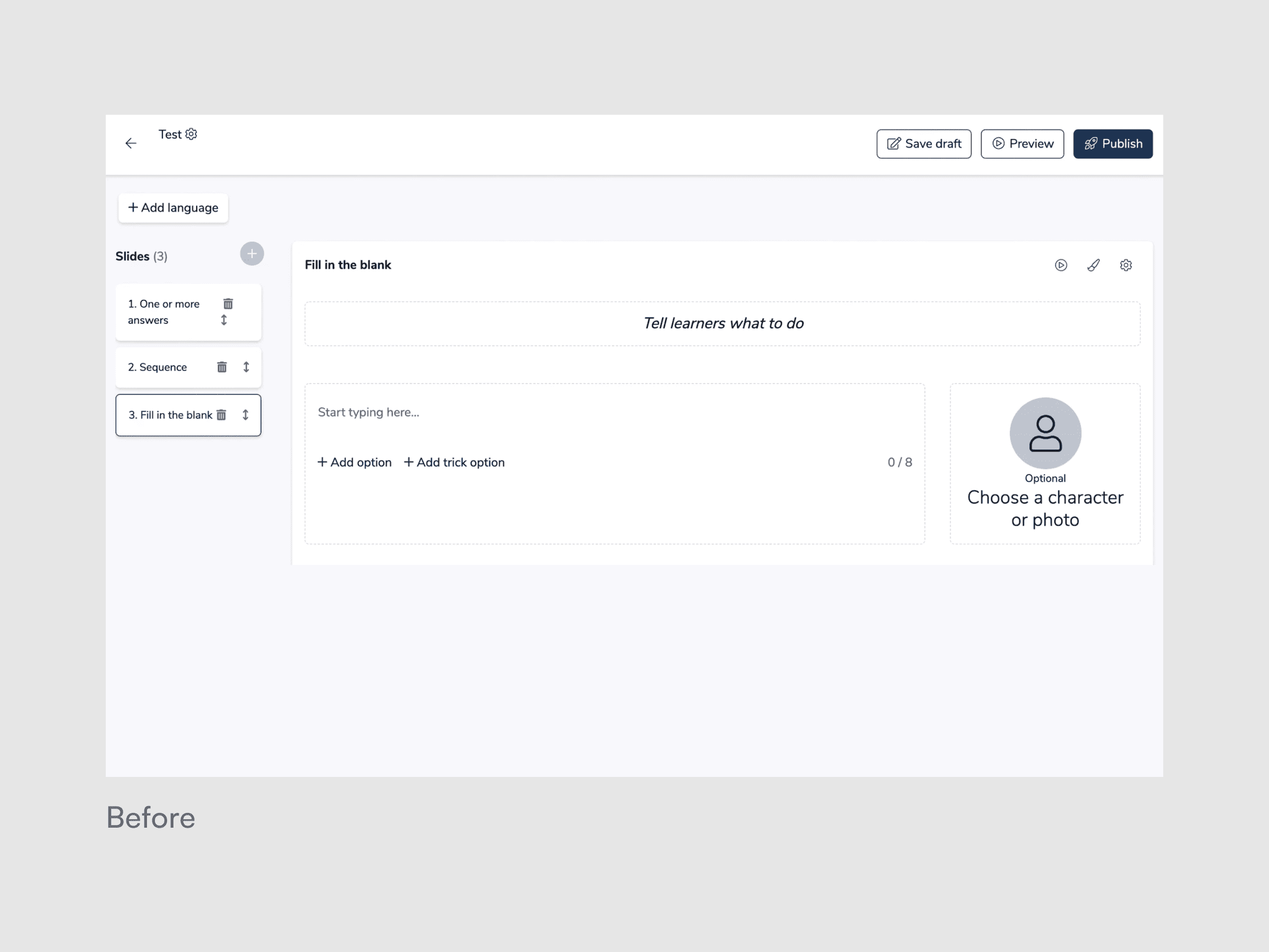
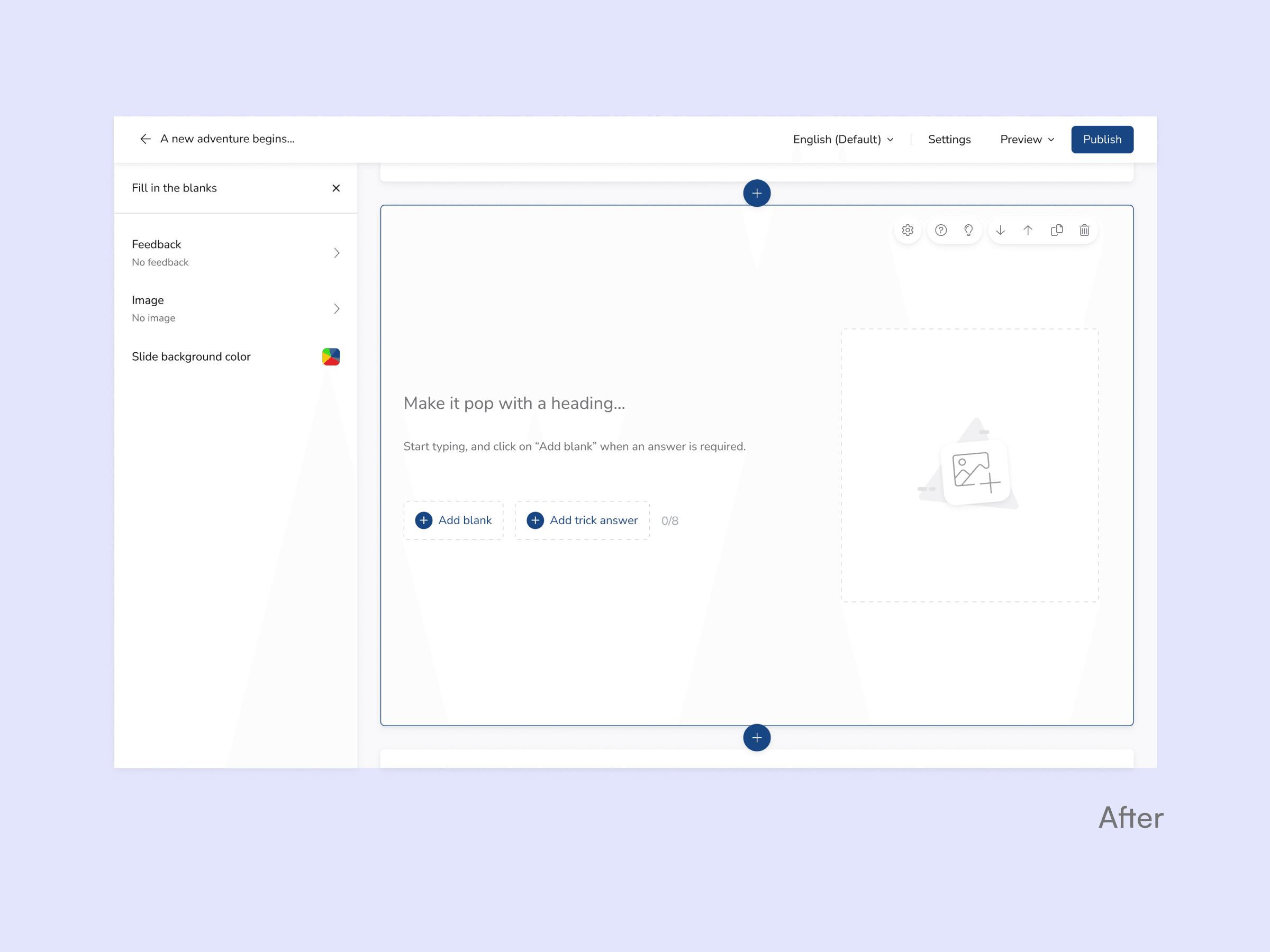
Learningbank's Module Maker is where admins build all employee training and the Module Player is where employees complete it. I stripped away years of accumulated friction and redesigned both tools, making content creation seamless & flexible and the learning experience clean & effortless.
2022
3 months
Sole UX/UI Designer
Product management
Usability Testing
Design Sprinting

The problem
The experience for admins building learning and employees completing it had deteriorated into something unreliable, cluttered, and rigid, after years of features piled onto an outdated tech stack.
Admins
Spent more time fighting to use the tool rather than creating content due to lack of creative flexibility, hidden settings, and progress loss due to errors.
Learners
Struggled to complete their assigned learning due to unintuitive interactions, accessibility issues and a frustrating mobile experience.
Internal
A company-wide tech migration required a full rewrite of both tools. That created a rare opportunity to rethink the experience entirely, but I had no product owner, 150+ problems to sort through, and a tight window before development started.


The how
Moment 1: Choosing what not to build
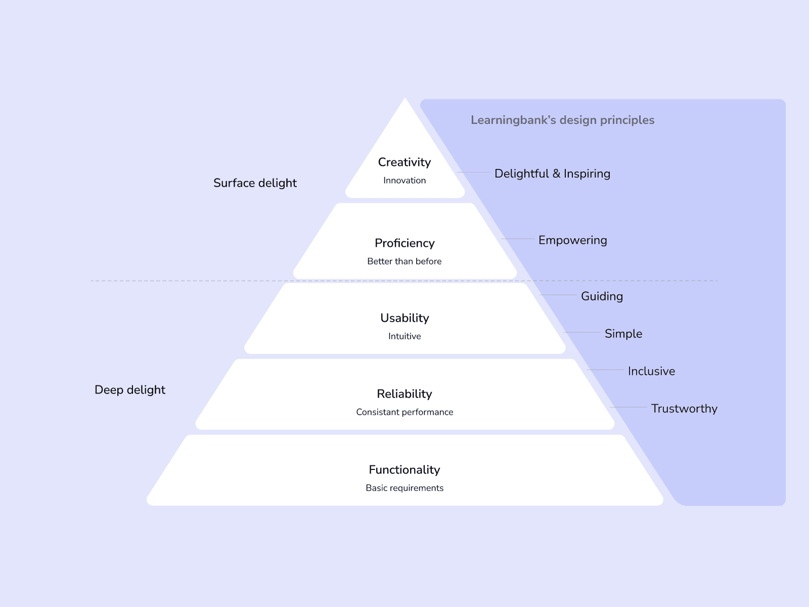
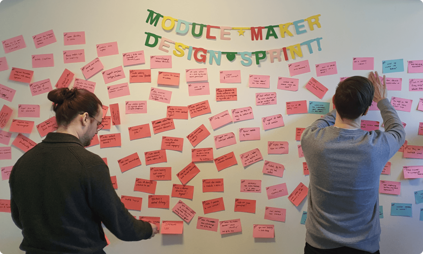
With over 150 documented user pains and feature requests, the pressure was to spread effort everywhere. Instead, I applied a needs-based prioritization pyramid I’d introduced to the company in a previous project, sorting sorting everything from foundational (reliability, usability) to surface-level (creativity, delight).
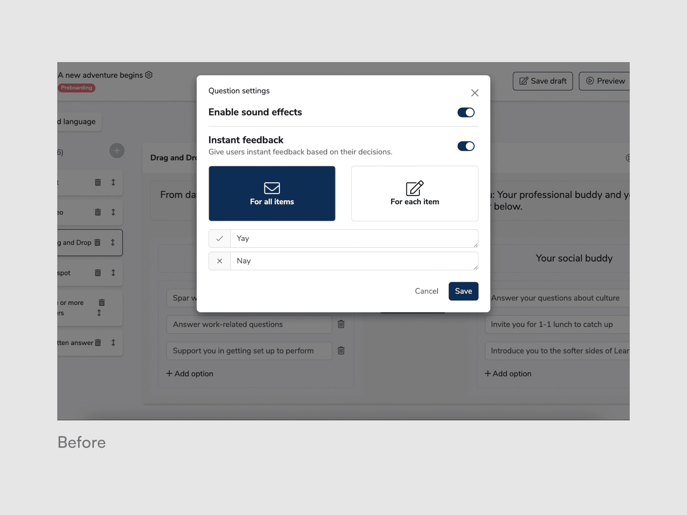
The call: Set aside the exciting feature requests such as fancy slides and new badges entirely for V1. Focus on fixing the foundation and interactions that prevented a smooth experience: the crashes, the broken slides, the hidden settings, the confusing translations.
That decision is why the rebuild worked out. Every new addition after launch had a stable, trustworthy foundation to land on.

Moment 2: Getting alignment in 10 hours instead of 10 days through a compressed Design Sprint.
We knew what to fix. The question was how far to go. Does fixing the foundation mean cleaning up the existing flow, or rethinking how content gets created entirely?
In a condensed 2.5-day designed sprint, we mapped the challenge, agreed on focusing on the foundation, aligned on goals, sketched competing directions, and voted on the strongest elements. The biggest challenge from it was exploring the content creation approach from structured templates to a Powerpoint-style free canvas where admins could place anything anywhere.
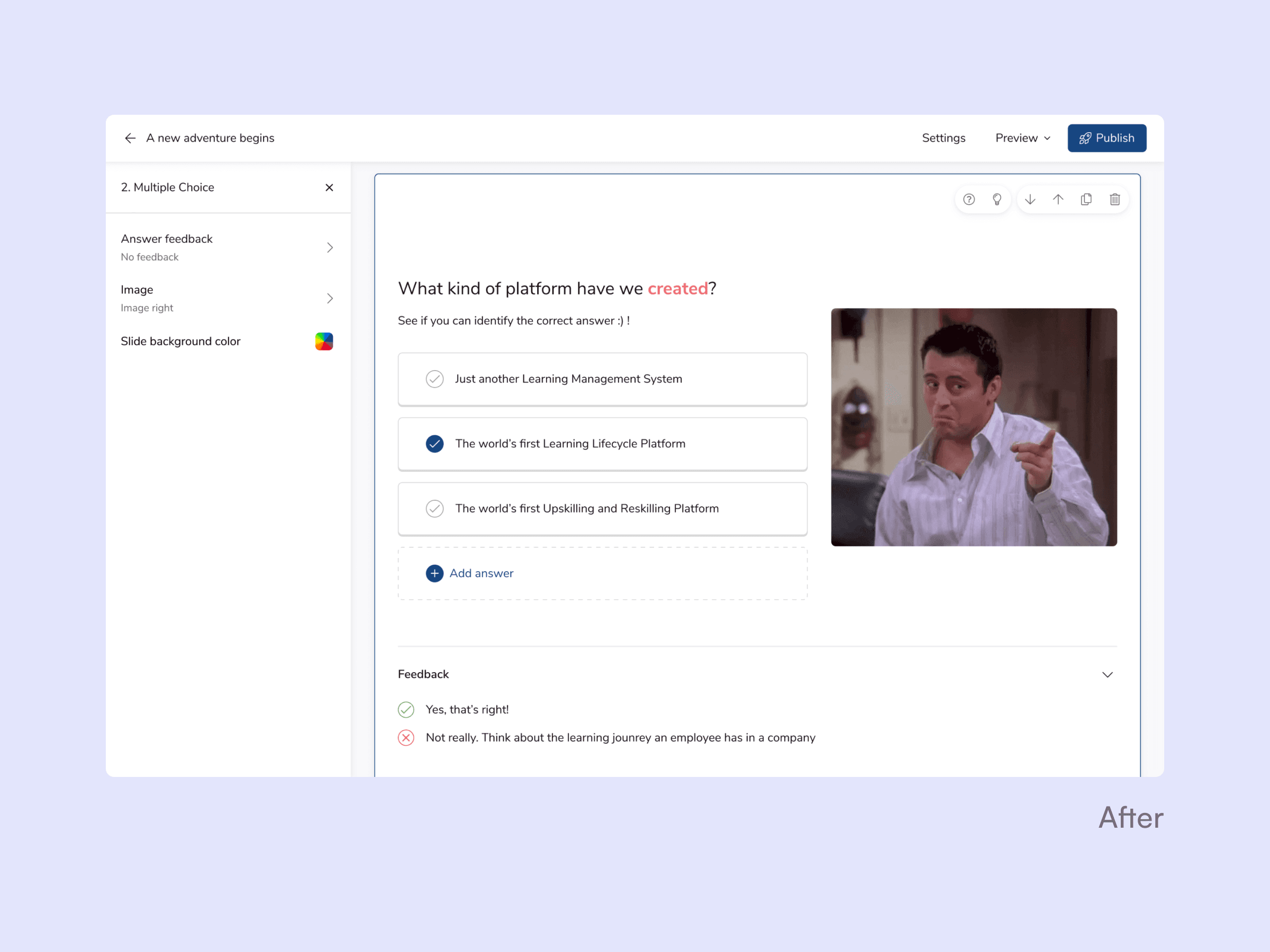
The call: Structured layouts were there to stay. A free-form canvas would have given admins more creative freedom, but at the cost of learner accessibility and usability for the many admins who aren't designers or content creators.
That boundary made everything else possible. Locked layouts meant we could guarantee content would display cleanly on desktop, mobile, and in any language, no matter who created it.
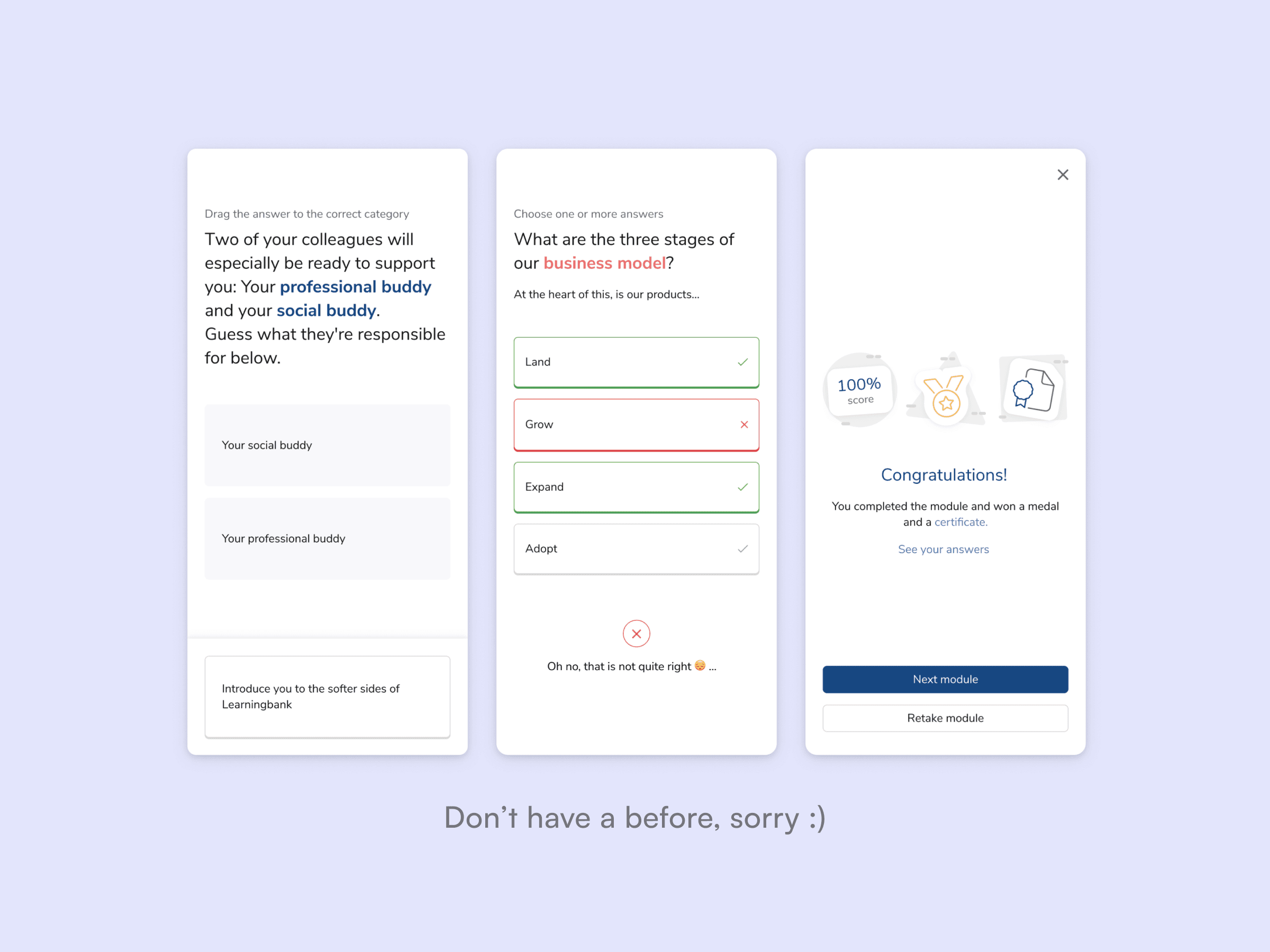
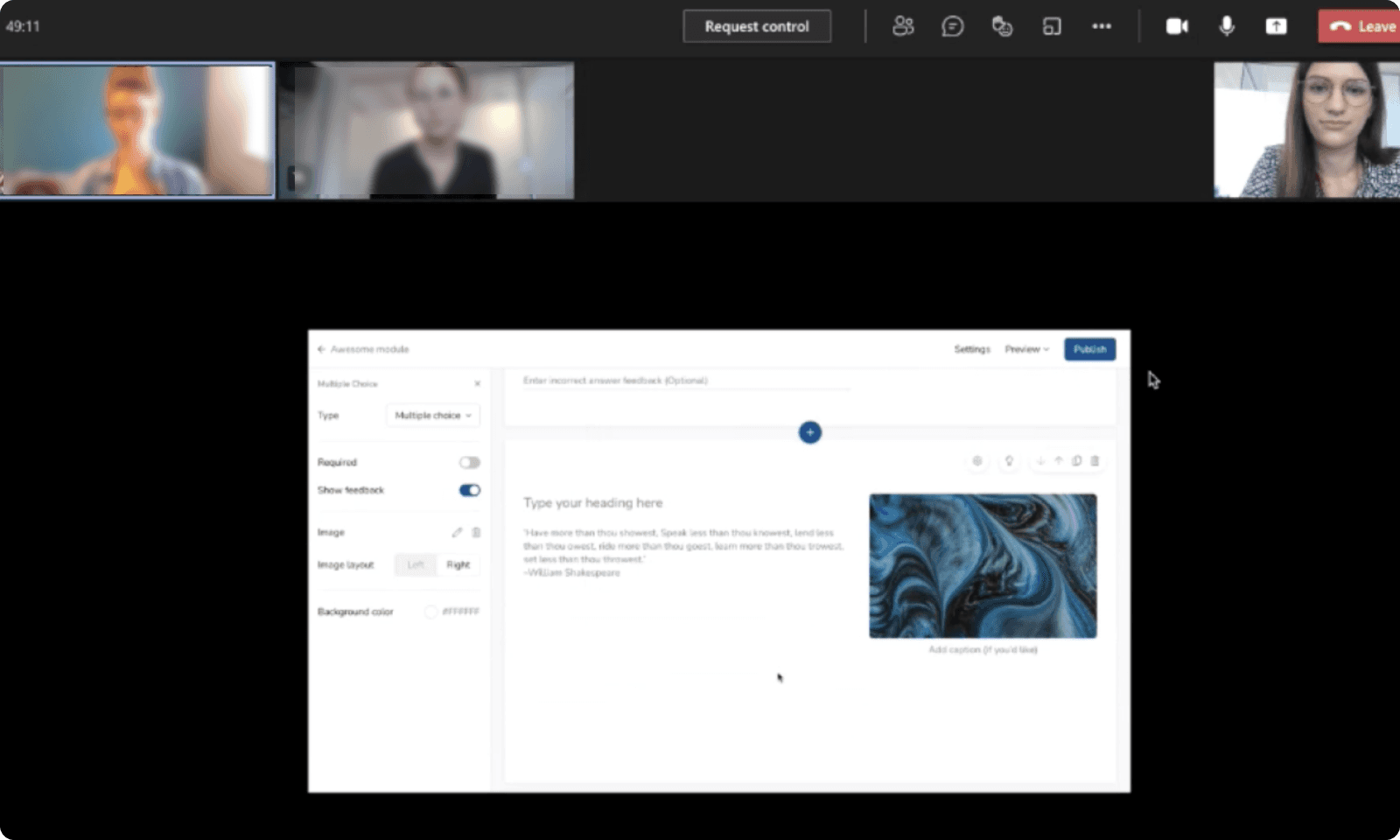
Moment 3: Stress-testing 24 slide types across every platform, device, and language
Each slide type had to feel equally intuitive whether an admin was building a simple text slide or a complex interactive quiz, and equally clean whether a learner was completing it on desktop, on their phone or in German.
Early rounds revealed that interactive formats like quizzes and fill-in-the-blank needed completely different interaction patterns on mobile than on desktop.
Later rounds caught subtle issues like input fields that worked fine for English but broke with longer German translations, and feedback states that were clear on desktop but invisible on small screens.
The result: 24 slide types that behave consistently, adapt to any screen, and let admins create confidently knowing the output will work for their learners.